Beginners Tips To List Building Part 2
This is the second in a new series of articles written especialy for beginners, which fully describes exactly how to go about starting to build a list of email subscribers from scratch. this time we concentrate on the Squeeze Page.
A Beginners Guide To Putting Together A Successful Squeeze Page
To help you create the most effective squeeze page possible, here is a quick overview of the most important elements that you need to include in your own squeeze page:
Compelling, Attention-Grabbing Headlines
Your squeeze page’s headline should be the very first thing that your visitor sees and therefore it needs to attract attention, draw them in and keep them focused long enough for them to become a confirmed subscriber of your mailing list.
Your headlines text size should be larger than the rest of the text on your page, and for increased exposure, consider adding color to your headline (red and blue works well).
You could also consider highlighting your headline and any sub headline that you use.
You can use the
and
HTML tags to enlarge your text, which will not only help with capturing attention from your visitors but will also alert ‘search engine robots’ that the enlarged text is important.
Center your headline within your template and try to work in your opt-in box so that it is close to the headline itself. If you are using a CSS based squeeze page, your opt-in box could be placed in a right column, with a bullet list of benefits featured in the main body of your page.
Content/Body
You should keep your content trimmed down so that it focuses only on the most important information that you have to share.
Avoid wordy squeeze pages that offer endless paragraphs of information. Your squeeze page has ONLY one task, to convert visitors into subscribers and so you need to keep it clear, concise and of course, exciting!
You will want to split test your copy (including lengths) to determine what will increase conversion rates, but in the meantime, here is a quick overview of how to better structure your squeeze page content so that it is easy to read, understand and encourages subscriptions:
1) Use Bullet Points To Highlight Benefits
Bullet points emphasize important features and draw attention to the special aspects of becoming a subscriber of your list.
This is a great way to showcase the benefits of becoming a subscriber, and what they will receive, in return, for their subscription.
For example, if you were offering a report on the ‘Insider Secrets To Finding A Work At Home Job’, your benefit list could include:
- Find out how to land a high paying telecommuting job even if you have absolutely no experience online!
- Avoid devestating work at home job scams that circulate the industry and target people just like you!
- Discover the #1 freelance website where 99.9% of new telecommuters are able to secure employment in their first week online.
- Create a compelling resume that guarantees you stand out from the crowd and get noticed by top paying companies online!
2) Retain Focus At ALL Times
Eliminate any external links and keep your squeeze page focused. You want to avoid distractions or in directing potential subscribers to external websites (or even internal pages on your site). Strictly, no banner ads, affiiate links or links to other webpages AT ALL!
Their ONLY option should be to subscribe to your mailing list. You don’t want to confuse them or deter them from your one objective; getting that lead.
Your squeeze page should be one-page long, feature your bullet list, headline, opt-in box and private policy. Eliminate clutter and any information or content that is not necessary to securing the subscriber.
3) Include A Strong & Clear Call To Action
If you want your squeeze page to successfully recruit new subscribers, youNEED to clearly direct visitors to fill out your opt-in form and confirm their request.
Do NOT assume that people know what to do. Remember, not everyone is likely to have experience with mailing lists, and so you need to directly instruct them as to how they are able to gain access to your free, high quality offer.
Just the same, you also want to direct them to confirm their request to you’re your list once they have entered in their name and email address.
If you are using a double opt-in format, you will NOT be able to communicate with subscribers who have not verified their request, so make absolutely certain that you are following up and instructing everyone to confirm. (You can do this by automatically directing subscribers to a secondary page on your site that thanks them for subscribing and tells them that the final step is to check their email and confirm their request to join your list by clicking on the verification link sent out by your autoresponder system).
Just like your squeeze page, keep your confirmation page clean and crisp. Avoid ANY external links at this point because you need your subscriber to follow your instructions instantly, eliminating any chance of them forgetting to confirm.
Consider highlighting your call to action, or using bold text to emphasize it, like this:
Submit Your Information Immediately To Claim This FREE Report – Before It’s Gone!”
This creates a sense of urgency and gets them excited about what you’re offering. This is an important element to keep in mind. You also may want to try a more specific scarcity tactic, like,
“Only 25 Copies Available !
Claim Yours Before It’s Gone!”
4) Minimize Graphics and Use Them Wisely
Your squeeze page should load quickly and remain clean and focused. However, it’s been proven that using report covers, or ecovers can increase subscriber rates by giving your visitor a visual picture of what they will receive after subscribing to your list.
Make sure that the graphics you use are high quality and original, and that your report cover portrays the product or offer you are giving away accurately.
If you are offering a short report on ‘Dog Training Mistakes To Avoid’, make sure that your report cover clearly illustrates the topic.
TOP TIPS TO REMEMBR:
Always make sure that you personally go through the subscription process before launching your campaign to make sure that you receive the initial welcome email sent out by your autoresponder, and that your opt-in box itself works properly.
You NEED to make sure that you emphasize the benefits of joining your list, and that you highlight the opt-in box, drawing attention to it and whenever possible, keeping it visible above the fold.
Always use a headline that explains exactly what they will receive after they become a subscriber. People don’t always give away their email address so easily and it’s your job to explain exactly how they will benefit by doing so.
Regardless of how you structure your squeeze page, you need to thoroughly test what works and how you can improve it.
In the next article, I will show you exactly how to set up a simple split testing system so that you can tweak and improve your squeeze page conversion rates.

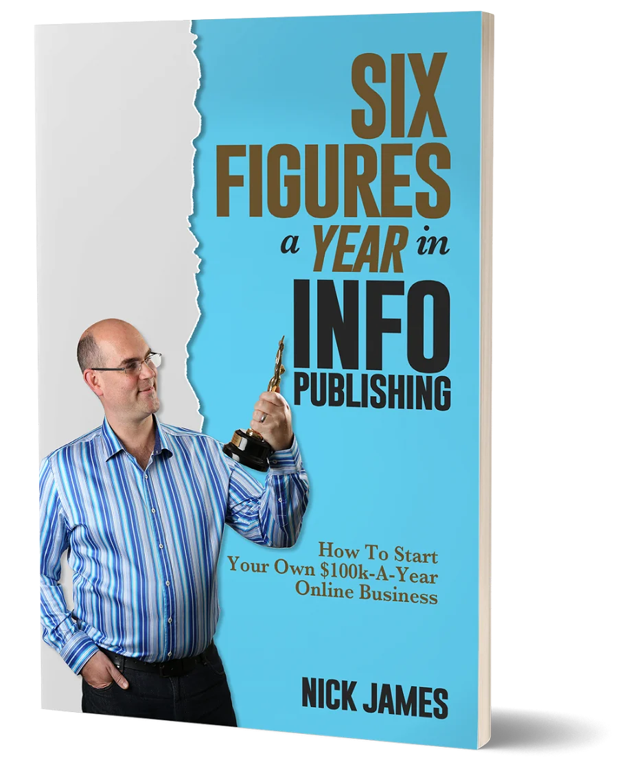
Author offers a FREE copy of this book to his next door neighbor... to prove he's not a drug dealer!
Now claim your FREE COPY.
and follow the step-by-step instructions for making the kind of money (and living the kind of lifestyle) that'll get your neighbors curtains twitching with curiosity!
Enter your details below to discover how to claim your FREE COPY of 'Six Figures A Year In Info Publishing' ...
Privacy Policy : We value your privacy. You can unsubscribe from receiving future emails with 1 click at any time.


